


Texas A&M Agrilife
Modernizing the Texas A&M Agrilife web ecosystem
for incoming students and current faculty
Skills
UI/UX Design
UX Research
Team
1 Product Manager
2 Lead Designers
2 Design Interns (Me)
2 Developers
Tools
Wordpress
Figma
Hotjar
SiteImprove
Timeline
11 Months
June 2024- May 2025
Overview
One of the Largest Public Universities in the Country Struggles to Engage Users
The AgriLife Sciences is the college within Texas A&M University with over 8,000 students enrolled and employ nearly 400 faculty members across 16 departments. AgriLife offers an Extension Service that functions as a public outreach and education agency, delivering non-formal, research-based education to communities across Texas.
The Final Deliverable
Our team led the restructuring of 16 websites across both the sciences and extension departments. Our priority was to provide current students, prospective students, and local farmers with vital information, as well as bridge communication gaps between department heads, research staff, and educational initiatives.
My Contribution
Website Design &
Launch
Helped design, evaluate, and launch 15 department web pages using WordPress and Figma, ensuring usability, consistency, and alignment with organizational goals.
Site Architecture &
SEO Focus
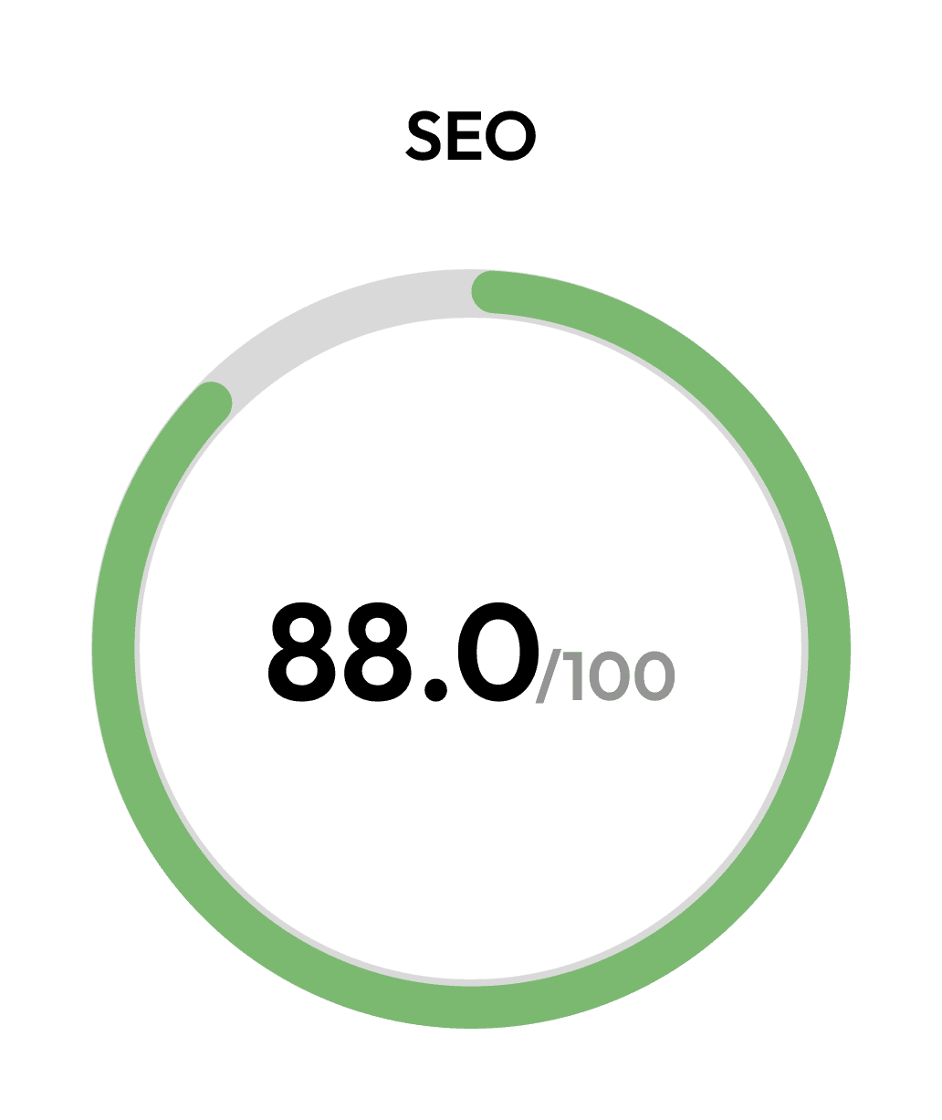
Restructured site architecture and resolved backend issues affecting shared content across AgriLife sites; improved SEO, navigation, and overall traffic.
Content Quality &
Stakeholder Collaboration
Audited sites to fix inconsistencies, broken links, and outdated content; refreshed pages with updated articles, visuals, and stakeholder-validated information.
Impact
Site Rollout
16 Sites
Were modernized and shipped to the AgriLife online ecosystem.
Accessibility Rating
92.5
Average Accessibility rating of all sites created by our team, evaluated by SiteImprove,
Reach
8,000+
students, staff, and local communities use these sties for information, resources, and support.
Organization Recognition
Increased Initiative
Our site remodel persuaded other parts of the university to look at their sites and fund site modernizations
Challenge
Overhaul AgriLife Sites to Provide Essential Information in a More Accessible Manner
AgriLife sites had begun to have a very powerful reach across Texas, and with that came a variety of stakeholders. We first had to identify who we were designing for before going through the restructuring process we were tasked with.
Who Were We Designing For and How it Led Design Decisions
AgriLife sites had begun to have a very powerful reach across Texas, and with that came a variety of stakeholders. We first had to identify who we were designing for before going through the restructuring process we were tasked with.

Current &
Prospective Students
Needed easy access to research and study abroad resources, application deadlines, and course and contact information.

Administration &
Staff
Needed a platform to easily communicate changes and new opportunities the department was rolling out.

Local
Communities
Needed a way to easily access vital information that was coming out of research departments within each department.
What Were Our Stakeholders Dealing With?
The AgriLife web ecosystem had begun to face a significant challenge: students couldn’t find the vital resources they needed, department heads struggled to communicate research opportunities, and local communities lacked a consistent, reliable way to access information across the many sites. In short, it was a classic case of poor user experience. Specifically, our users were currently dealing with:
?
Difficult Navigation
Each department site had a unique layout, style, and structure, making it hard to consistently access essential information.
Written 4 Years Ago
Update?
Outdated Information
Departments evolved over time, adding new programs while cutting others, but their sites often featured outdated or irrelevant information.
Slow Performance
Poor site structure and inefficient asset use caused performance issues and lag, leading to ongoing user frustration with how slowly and ineffectively information was delivered.
404
Broken Links
Department sites linked to various internal and external pages from study abroad resources to seasonal pest alerts. However, many links were outdated or broken, lingering on main landing pages without updates.

Design
Redesigning Sites to Maximize User Retention
After finding the main issues these sites were experiencing, our team utilized WordPress to build these sites from the ground up, migrating information from the old pages into our new design. Initial design system standardized in Figma and then brought into the pages we built up. Below are some of the ways we addressed those main issues.
Streamiling Navigation
The main form of user frustration regarding navigation manifested itself in the navigation bar. Each site had a completely different information architecture from the others, leading to frustration and early drop off rates due to complex and varied organizational structures.

Modernizing Site Look and Information
Outdated information and visuals had led to a loss of user trust with the sites, the main parts of the design process happened here, where page layouts were revamped and filled with the most recent information relayed from department heads of each college.

Improving Server Load Times
Slow performance speed was a result of multiple symptoms, most of which were address in the migration of old sites into WordPress, however, one of the largest reasons for bad performance speed came from images that slowed page loading times.

Designing for Intuitive Flow
Fixing broken and outdated links was only one part of this task, we sought to find ways to make intra-site travel more efficient. That looked like being intuitive with the information we provided in different parts of a given site. Adding links to relevant news, connecting resources from one site to other that are also benefitting, and many more.

Evaluation
Assuring Quality Pre-Launch
Testing with Internal Stakeholders
We constantly had an open dialogue with department heads who were approving changes made to the sites of each department.
We used Hotjar as an asynchronous form of evaluative testing, so department heads could request changes at any hour of the day, which we would then compile and make batch edits.
They made sure to verify information as up-to-date, as well green light the new pitched sites.

Maintaining Shine Post-Launch

Scroll heatmap on Hotjar used for evaluative testing.
Spotting Areas of Improvement Live
Once Sites were launched, our team still maintained a watchful eye on how the sites were being received by students and local communities
We used Hotjar to view scroll and mouse heatmaps of pages. Using this info, we were able to understand what parts of our design were in need of fine-tuning, and what spots excelled in transmitting information
Impact
Aligning Output with Success Metrics
Overall, this project was a major win for the AgriLife community and the greater Texas A&M community. Our team went above and beyond and created a wildly successful output, that began a larger trend within the university to modernize other digital spaces that Texas A&M occupies.
In What Ways Did We Succeed?
The successful design and shipping of 16 department sites.
Drastically improved SEO by an average across 30 points on SiteImprove across all sites.
Successfully addressed the 3 success metrics our team initially set up.
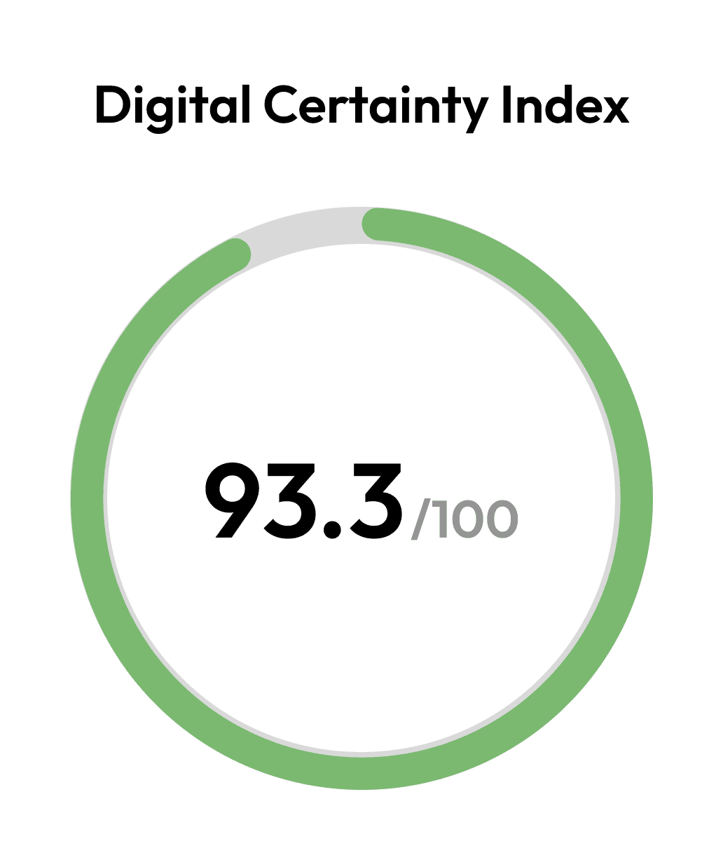
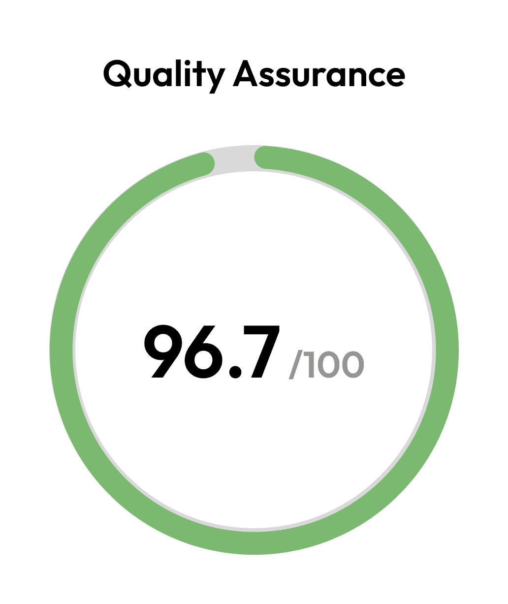
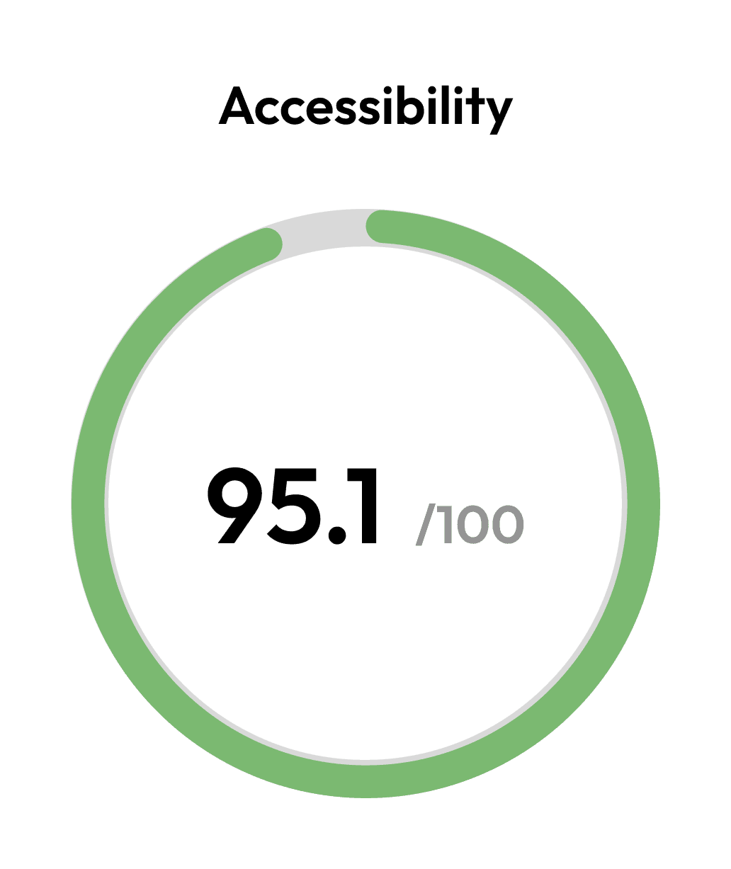
Example of successful DCI scores across the board on the TAMU Horticulture site on SiteImprove.
